“The Connector”
How the Angle and the Arc symbolize people-first engineering

How the Angle and the Arc symbolize people-first engineering
You might have noticed some new shapes popping up across Michigan Engineering’s buildings, websites and social media.
These shapes are simple and familiar, and at first glance they may not have any obvious connection to engineering. But there’s meaning behind them. Here’s an inside look at how they represent the College’s unique approach to teaching and practicing engineering: people-first engineering.
Historically, the benefits of technologies and engineered systems have not been distributed equally, and people-first engineering aims to change that. It is focused on closing societal gaps and elevating all people. To be successful, it requires three components: excellent engineering fundamentals, a convergence of disciplines, as well as equity-centered values and global worldviews.
Those ideas were translated into visual language by Mathias-Philippe Badin, Creative Design Manager at Michigan Engineering.

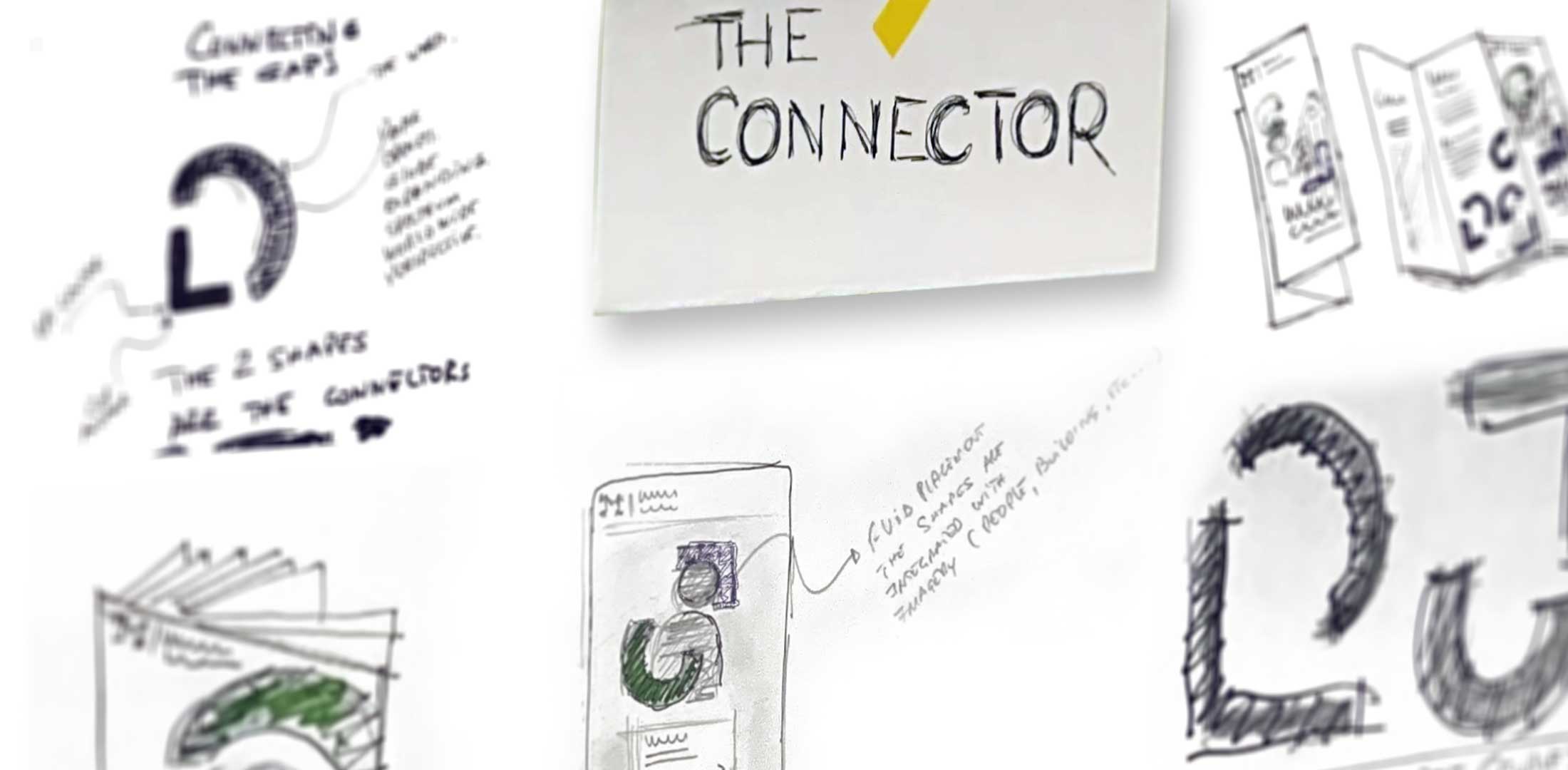
The right angle—the intersection of two perpendicular lines—represents the traditional, foundational aspects of science and engineering: the fundamentals that undergird technical excellence as an engineer. “This shape is the anchor,” Badin said. “It is sturdy and stable.”
This curved shape represents the human aspects of engineering: the equity-centered values and global worldviews that make it possible to conduct our work in a way that closes societal gaps and elevates all people. It’s inspired by the curvature of the Earth and, for Badin, brings to mind an egalitarian aspect of ancient Greece. “Greek theaters were semi-circles that were famously arranged in a way that allowed everyone in the audience to see the stage and hear the actors equally well,” he said.


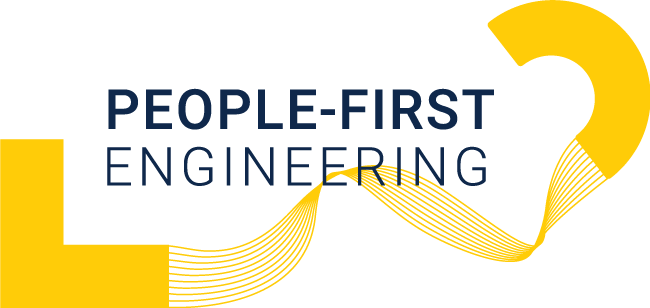
In the same way that people-first engineering requires all three elements to be successful, these two shapes always appear together—often connected by flowing lines that signify the convergence of disciplines.
When combined, the Angle and Arc make up The Connector.
“The Connector is a system designed to represent the systems built by Michigan Engineers,” said Badin. “The Angle anchors it with a solid foundation. The lines evoke ideas about exploring, adapting and changing your mind. They lead to the Arc, which stands for the broader perspective that we hope will resonate throughout the world.”
The Connector is not a logo. Nothing can replace the Block M, the official logo of the University and Michigan Engineering. The Connector is a visual symbol for how we aim to teach and practice engineering, through a people-first framework.
Art and engineering converge with Arc & Angle, by U-M Stamps School of Art & Design student Colin Hunter. As an artist and researcher in Michigan Engineering’s Aerospace department, his work is really fascinating. When students collaborate across disciplines, the outcomes are inspiring.